ArtFund Museum Awards
Made to
Stand Out
-
ArtFund Museum of the Year
-
For the last four years I have been chosen to work alongside ArtFund in the creation and design of their Museum of the Year Awards. The awardees have included; The Barbara Hepworth Museum, The Tate St.Ives, The V&A and The Tate Modern. All of which are proudly showcasing the awards in their museums.
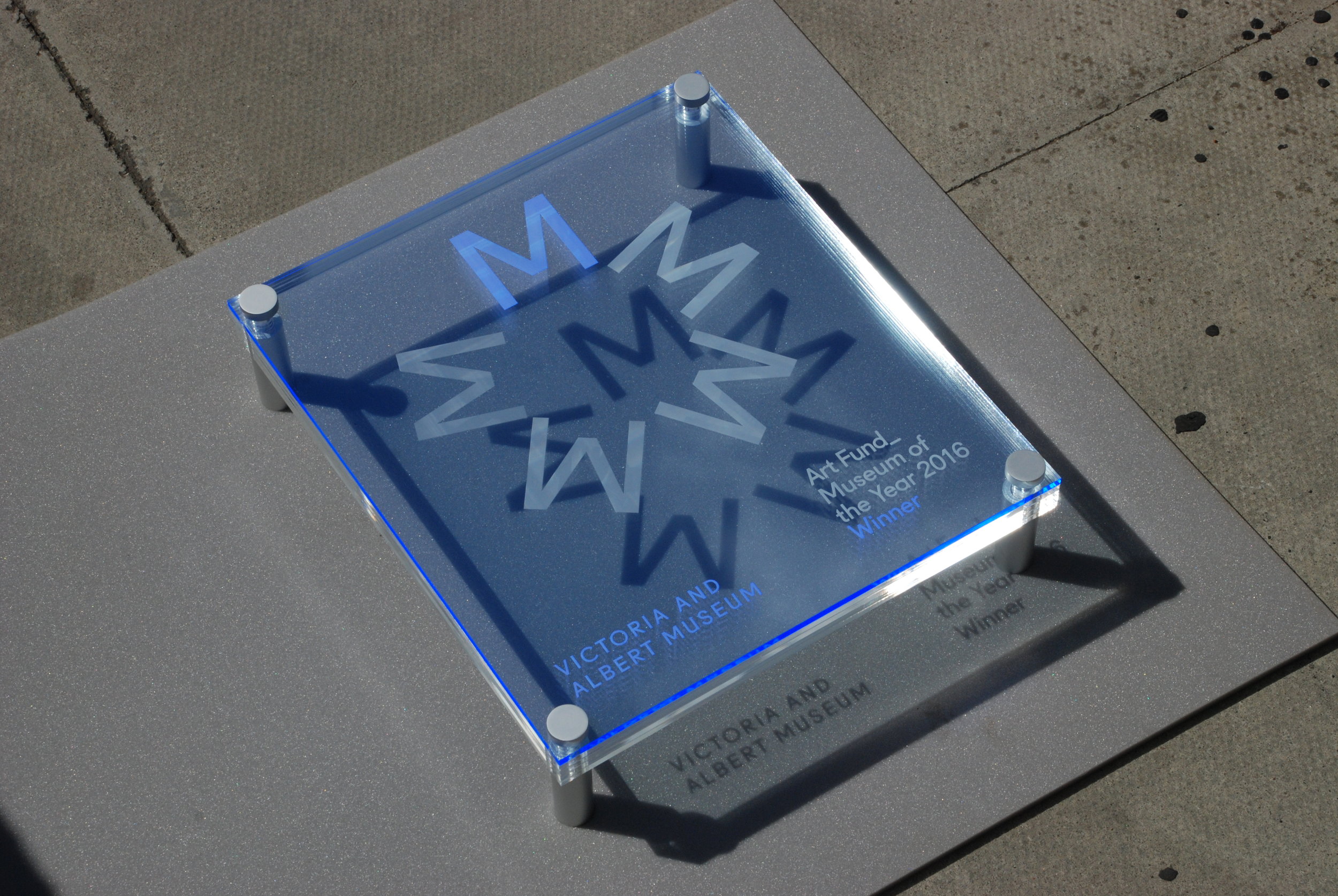
We started with the V&A. This was the first time I had worked with ArtFund, so I was keen to impress, making sure that what I designed was not only well made, but also clearly displayed their Museum of the Year branding. I wanted to make sure it had a quirky element that intrigued the viewer. As this plaque was to be displayed in a gallery, it was important for me that the design itself would hold its own against the beautifully curated pieces in the V&A.
This award was made up of 4 sheets of clear acrylic top with a sheet of Perspex’s Fluorescent Neptune Blue that reacts to UV light. Each layer had one of the “M”s in the logo laser engraved into it creating a rotating, 3D effect which looks interesting from all angles. The clean yet elegant approach perfectly suits the V&A, with its ever-changing exhibitions historic and new, a clean and timeless design fits.
The V&A
2016
Winner
-
The Hepworth Museum
2017
Winner
-
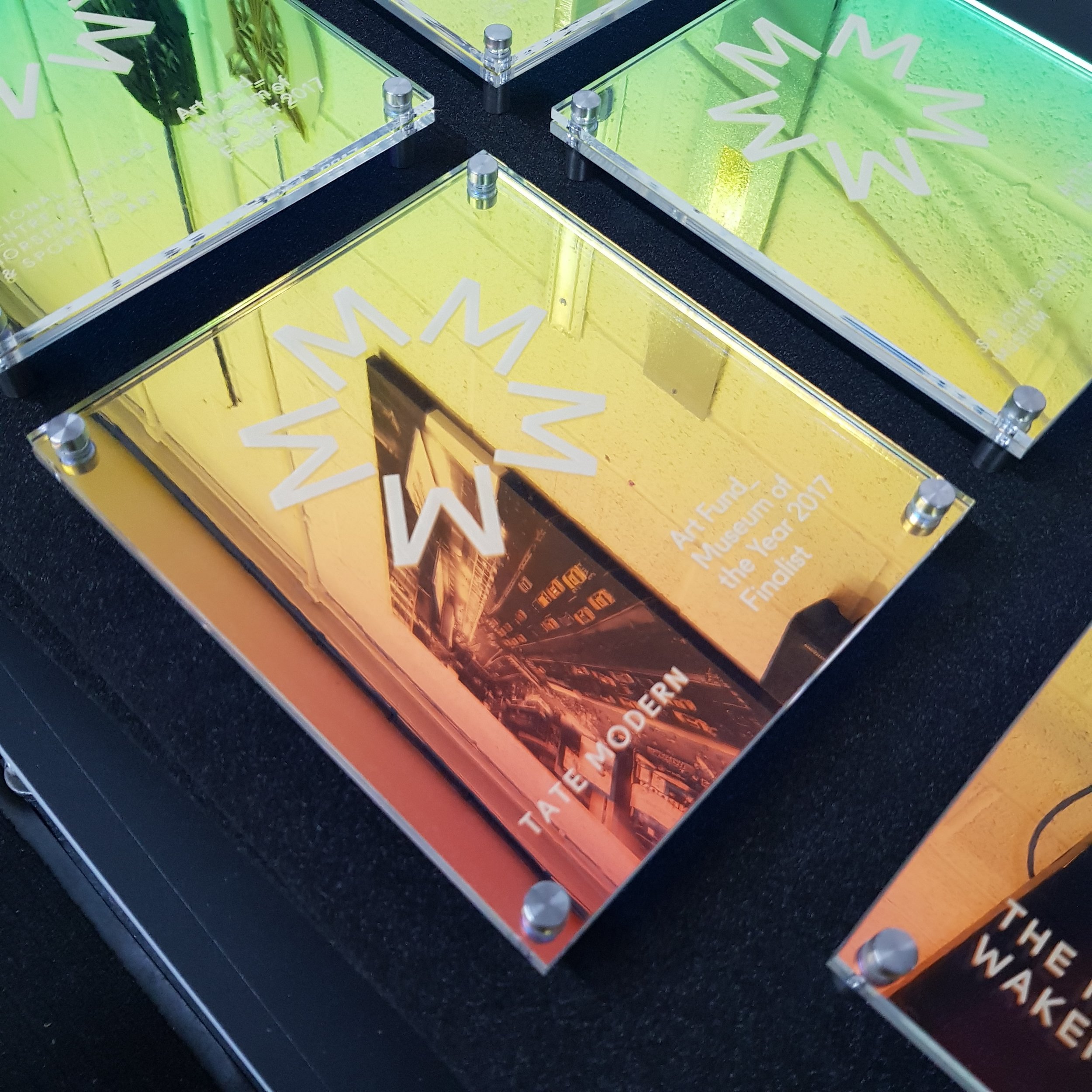
In the second year, the winner was The Hepworth Museum in Wakefield. With one of the runners up being The Tate Modern. Keen to make something that not only was in sync with the previous years award but also had a whole new take on the design as I knew the award would be in places such as The Tate Modern, who was a runner up, I thought that it was important for the plaque to be a stand out piece that caught attention even amidst the most wild of exhibitions.
I decided to pitch a beautiful translucent dichroic film that not only glimmers in multiple colours, depending on what angle you look at it but also has a slight reflective quality that makes the piece eye catching to a passer by. To keep continuity amongst the previous awards, I decided to keep exactly the same engraving layout for the top layer and the bottom layer was to have the film stuck to it, sandwiching it between the two sheets of acrylic. After this design I realised that new and inspiring materials were going to be the focus of the plaques from now on.
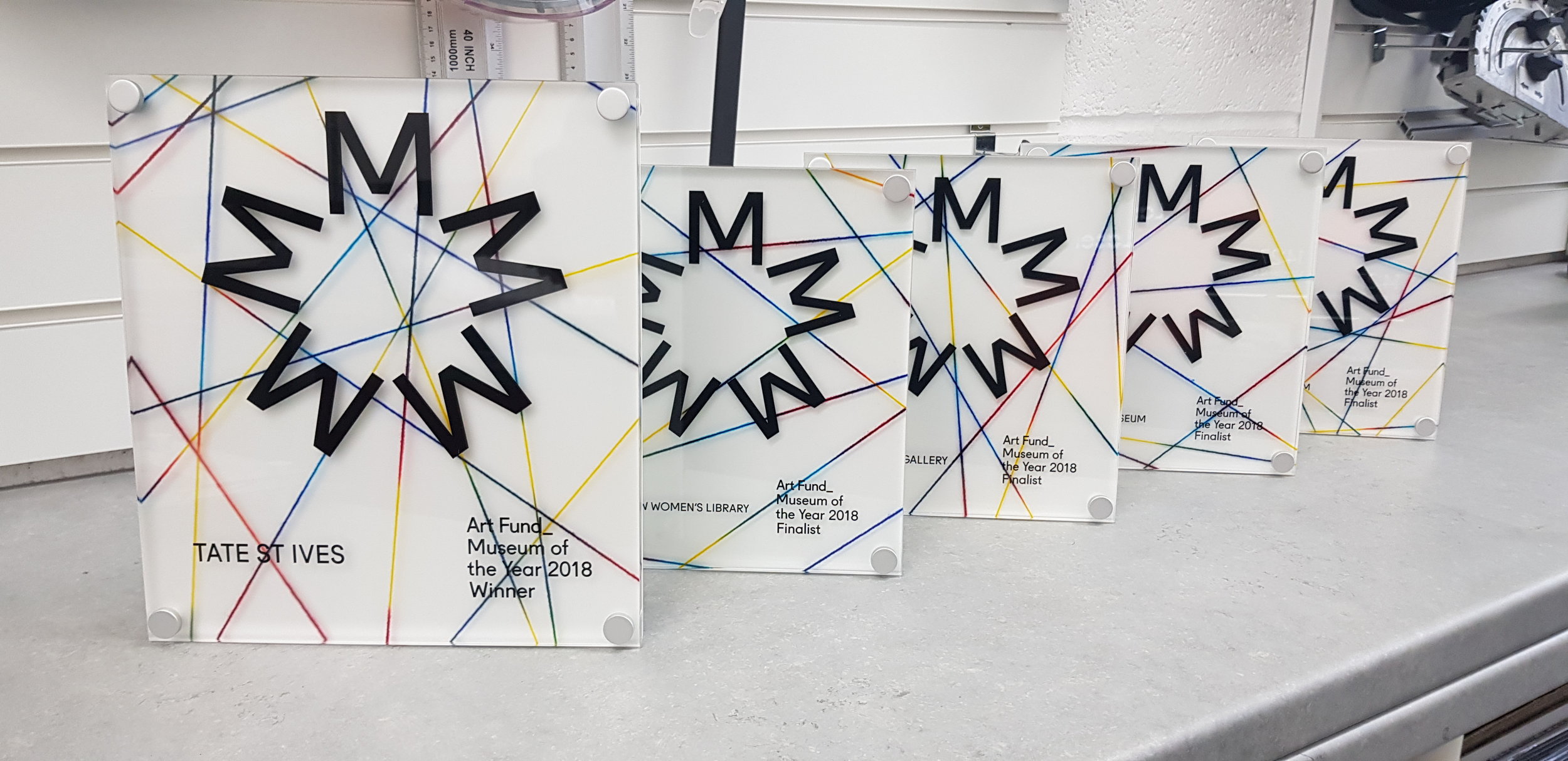
In year three, the winner was The Tate St Ives. Keeping with the same previous layout as the last two awards I once again focused on the material that was going to be used. I opted for an acrylic that had coloured yarns hand cast inside the sheet, crossing over the sheet at different depths. I found out about this type of acrylic as I had recently been sent a set of examples from Pyrasied who were keen for me to use their unique designs in some of my projects. This material perfectly suited The Tate St.Ives. Located in a creative hub in Cornwall, I believed that the “crafty, handmaid” element to the design fit perfectly with the towns spirit.
When making the plaque I opted to print on the reverse side of the front layer of the plaque, using my Roland Direct to Surface UV Printer, instead of the usual engraving, as this stood out better against the predominantly clear acrylic. I also sandwiched the cast acrylic in-between two clear sheets to add depth and finally backed it with a sheet of white to make sure the pattern wasn’t lost to the wall material in would eventually be mounted on.
Here at Lasercut.London I focus on the details, and making sure I can not only off you the best quality service, but also the best materials currently on the market. Continuously keeping on top of the latest developments and released through close connections with materials manufactures.
Tate St Ives
2018
Winner
-
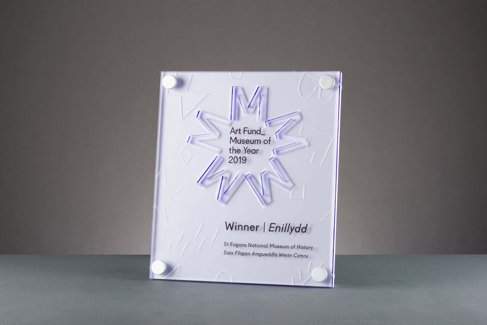
St Fagans National
Museum of History
2019
Winner
-
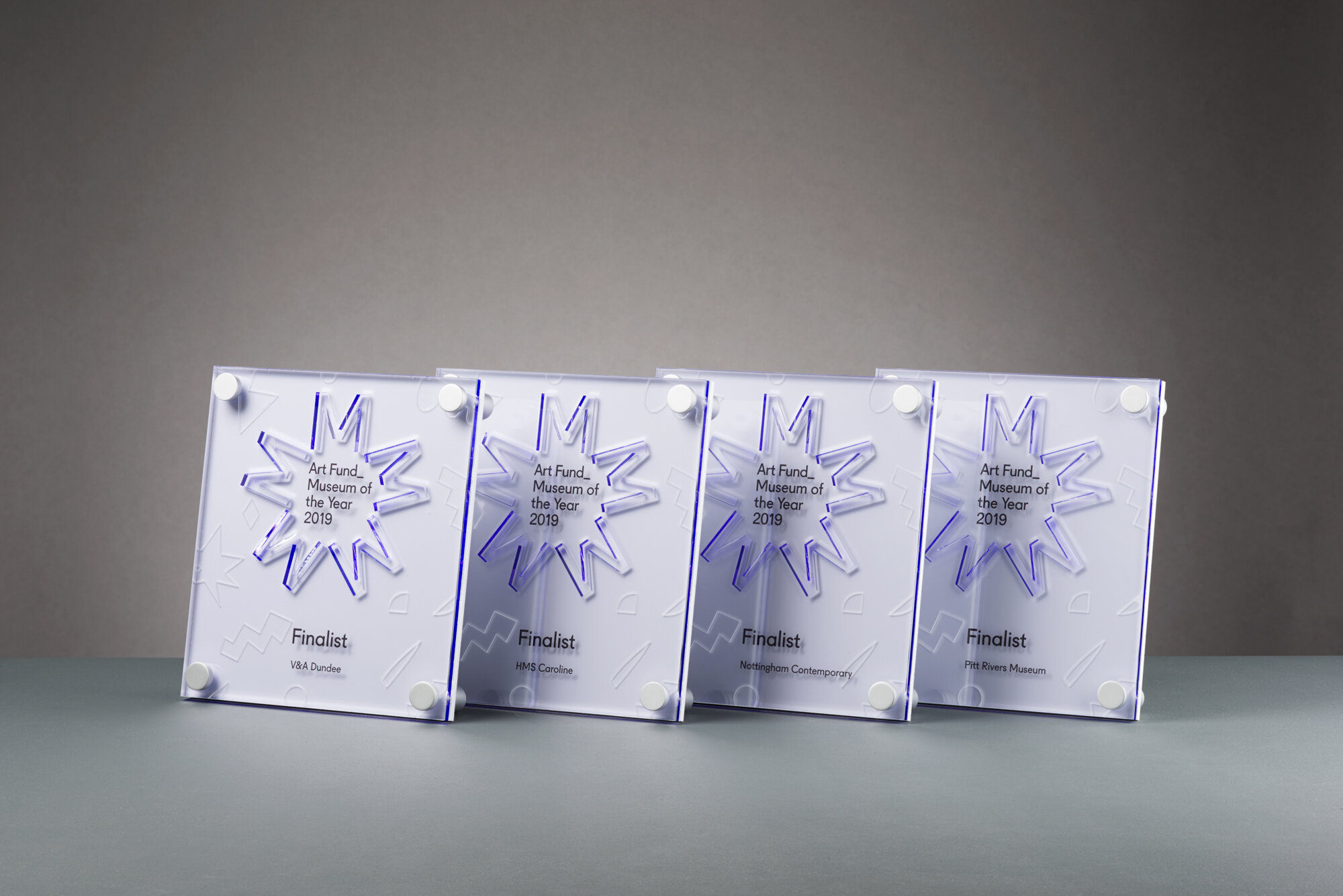
For the 2019 awards, the design was a vastly different and unique compared to previous years. In the intial design round we utilised a number of unique 3D shapes that were used in the award ceremony and printed media. Samples were made with different materials with very vivid colours that ArtFund_ had never used before.
The design was soon adjusted to feature a much more subtle range of coloured materials yet retain an equally unique design.
During a design meeting with ArtFund_ we came up with a few different idea variations using different material options, and on that same day created a selection of these designs in Fusion 360 to provide a few different fully rendered options.
We then created a sample award which used 4 different materials (3mm clear, 5mm, 3mm Pearlescent acrylic, and 3mm white acrylic)
The final award was again taken back and made somewhat more subtle. Finally, using the Vario range of perspex acrylics, and a floating vector engraving of the shapes initially conceived for the event.

